Homebot · 2019–2022

Design for the least confident user, and everyone else follows.

Homebot helps real estate agents and loan officers stay useful to clients long after closing. I was on the design team for the homeowner digest and the partner admin experience, from discovery through delivery, and built the practices that helped the team learn and decide together.

My role
Senior Product Designer
Worked on
Homeowner digest and dashboard, partner admin experience, mobile and responsive web
Worked with
Product Director, PM, Tech Lead, Engineering, CX, Marketing
Practices
Mentorship program, weekly Research Council, kickoff frameworks
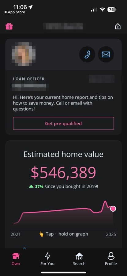
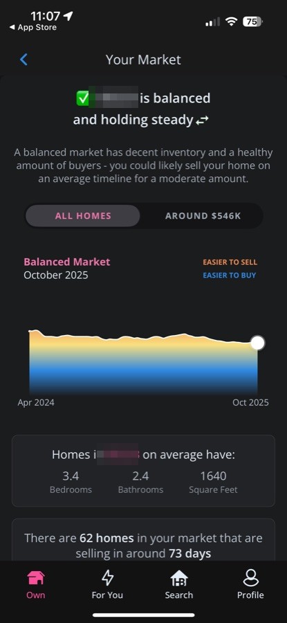
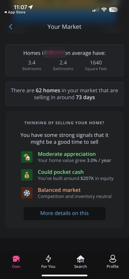
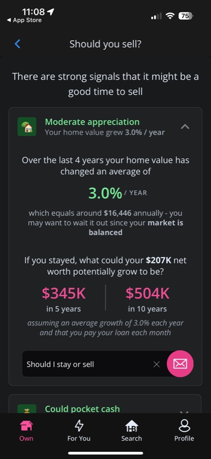
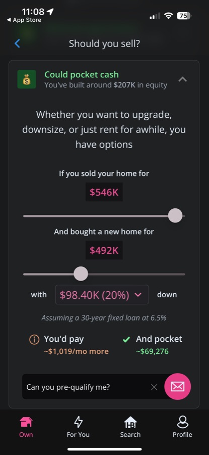
Homeowner digest on mobile: an agent card above the estimated home value, $546,389, with a value trend.Your Market: a balanced market with homes selling in about 72 days.Market details: homes selling, days on market, and signals about whether it is a good time to sell.Should you sell?: strong signals, with projected cash from a sale.A slider showing what selling now could buy in a next home.Refinance savings: paying a little more each month and how much interest it saves.
The homeowner digest in the live app, October 2025: home value, market, sell signals, next-home affordability, and refinance savings. From 2019 to 2022 I was on the design team behind the digest and the partner admin experience; the product has kept evolving since. Personal details are blurred.

The problem

Most agents lose touch with clients within months of closing.

Not because clients are disloyal, but because the relationship ends with the transaction. Homeownership is a long-term financial journey, and the advisors who stay useful through it are the ones who get the repeat business and referrals.

Homebot sends homeowners a personalized digest about their home's value, their market, and their mortgage, and tells their agent or loan officer when it's a good moment to reach out.


My role

Senior Product Designer on the design team, working from discovery through delivery across mobile and responsive web.

  • Worked on the homeowner digest and dashboard, turning complicated financial data into visuals people could act on
  • Ran research, usability testing, and behavior analysis with real users
  • Built the personas and flows that informed product strategy
  • Shaped direction with the Product Director, PM, and Tech Lead, and worked with engineering, CX, and marketing

Every quarter we ran the same cycle: identify problem spaces, prioritize by impact, right-size the scope, plan and run research, synthesize, and deliver solutions tied to business goals and user value.

Design for Felicia

We had four personas, and designed for the least confident one first.

Passive Pete needs nudges. Powerhouse Paul is a top producer who wants ROI fast. Motivated Miranda is growth-minded and already uses the tools. Flustered Felicia has been in the industry less than three years, is overwhelmed, and is slow to adopt new tech.

The principle: if we can build for Felicia, Paul and Miranda will still adopt, Pete will stay engaged, and Felicia won't churn. Designing for the least confident user made the product easier for everyone.

Income
$50K
Cash savings
$5K
Retirement
—

Watering holes

  • Friends and peers
  • College mentors
  • Facebook
  • LinkedIn

Persona · Designed for first

Flustered Felicia

A loan officer for less than 3 years, unsure she made the right call changing careers, and wondering when all her relationship building will pay off.

  • 35
  • Career change
  • Overwhelmed
  • Her hardest critic
  • Not an early adopter

“I want to feel confident in this career change.”

Flustered Felicia, the persona we designed for first.
How the four personas compare
Powerhouse Paul Motivated Miranda Passive Pete Flustered FeliciaDesigned for first
Time in industryLongShort / mediumLongShort
MotivationPassiveMotivatedPassiveMotivated
GoalGo big + retireBecome top performerCoast + retireLearn the ropes
Need for supportLowHighLowHigh
Business feelsToo much to manageGrowingChangeOverwhelmed

The homeowner digest

Homeownership builds wealth, but the finance behind it feels confusing, transactional, and intimidating. The digest aimed to make it easy, actionable, and personal:

  • Home value and equity: a live estimate, so "my investment is working" feels real
  • Market and sell signals: is it a good time to sell, and what would I walk away with?
  • Next home: what could I afford today, with no need to leave for Zillow
  • Refinance and PMI: what paying a little more would save, and when mortgage insurance can come off

Every view and click also became a signal for the advisor.

The partner admin experience

Advisors couldn't tell which clients to call, or when.

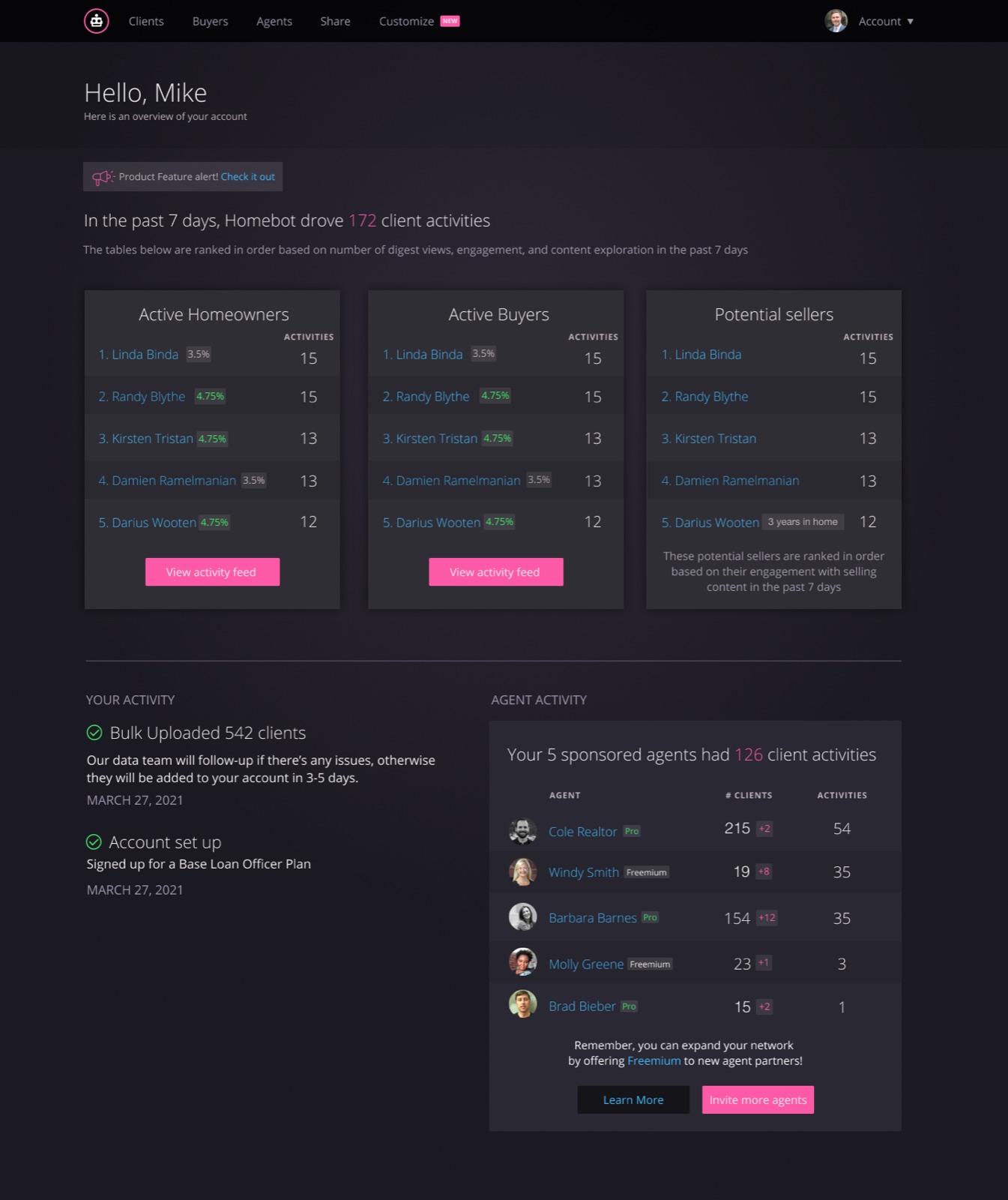
The goal was to make it effortless for agents and loan officers to spot warm leads and act at the right moment. The dashboard ranks the most active homeowners, buyers, and potential sellers based on what they've engaged with that week.

Ranked lists of who's engaging, so outreach starts with the warmest clients.

Research Council

Research kept happening inside one project and then vanishing. So I started a weekly meeting where it couldn't.

I created and ran it every week, mostly for product managers and designers, so one team's findings could inform another team's work.

  1. Sharewhat teams were hearing from customers
  2. Talk throughresearch in progress
  3. Compareinsights across problem areas
A shared board of sticky notes grouping what customers asked about and the biggest pain points they mentioned.
A board from one session: what customers asked about most, and where it hurt.

Kickoff frameworks

Two tools with one job: agree on the problem before jumping into solutions.

Both asked up front what we were trying to learn, how big the problem was, and how much research it warranted. An evolved version became the Design Kick-off Doc I publish for other designers.

Research kickoff template

Nine questions before any research starts

  1. OpportunityWhy should we care? Tell us a story.
  2. QuestionThe how-might-we this study answers.
  3. BackgroundWhy this work exists, and who the stakeholders are.
  4. UsersWho matters most, and what we assume about them.
  5. ObjectivesThe larger strategy it serves.
  6. ConstraintsWhat's known, what's in bounds, what must not change.
  7. SuccessThe decisions or artifacts it should produce.
  8. MethodsWhat we don't know, and the best way to find out.
  9. TimelineWhen it runs, and when outcomes land.

Tip from the template: limit yourself to 3–4 core assumptions or questions per study.

Right-Sizing Your Problem

Is the problem secretly a solution?

Starting point“Maximize customer’s time in Customer Admin”

  • Contains a solution?No. Good: it names the opportunity, not the fix.
  • A specific unmet need?No. Ask “What?” to narrow the scope.
  • A clear audience?No. Ask “For whom?” and why it’s their problem.

One of nine reframes“How might we transform onboarding for customers, because KPIs and CSS tell us many struggle to get set up?”

Mentorship program

I started the Homebot Mentorship Program to give people across the company a light, structured way to learn from each other and work toward their professional goals.

I designed how it worked: matching mentors and mentees, setting goals, agreeing on expectations, and giving each pair enough guidance to make the relationship useful without turning it into bureaucracy. About 12 people took part, and it ran quarter after quarter.

How it works

Every week, design a user interface element for mobile or web. A fun way to build skills and get feedback from the team.

  1. A Slack reminder every Monday morning points to the week's challenge.
  2. Challenges are intentionally high-level, so how to interpret them is up to you: mobile or web, a full page or one component.
  3. Everyone has a page in the workspace, so we can hold each other accountable and track progress.
  4. We discuss the previous week's challenge at Design Coffee on Wednesday mornings, about a week and a half after it's set.
  5. Designs don't have to stay inside the Homebot Design System. Animation, illustration, 3D, or a bare-bones wireframe are all fine.

Goals

  • Learn and support each other
  • Be inspired
  • Think outside the box
  • Keep on creating
  • Become better designers
  1. Sign up

    Create a sign-up page, modal, form, or app screen for signing up for something: a volunteer event, a contest, a giveaway, anything you can imagine.

  2. Credit card checkout

    Design a checkout form or page. Don't forget the important elements: the numbers, dates, security codes.

  3. Landing page

    What's the main focus? A book, an album, a mobile app, a product? Consider the important elements: calls to action, clarity.

  4. Calculator

    Standard, scientific, or a specialty calculator for something like a mortgage. For a phone, a tablet, a web app?

  5. App icon

    What best represents the brand or product? Does it look great at a distance and stand out on a home screen next to other apps?

  6. User profile

    Be mindful of the most important data, names, imagery, and placement. A serious profile? A social one? It's up to you.

  7. Settings

    Design settings for something. Security or privacy settings? Game settings? What is it, and what's important?

  8. Homebot DMs

    Design four iterations of our DM panel. How might it be more accessible, and make it clear how to use the input field and CTA?

The mentorship board: how the program worked, and the weekly design challenges.

I tend to step into ambiguous situations

and create enough clarity and structure for people to move forward.

What I learned

  • Education fuels empowerment, and empowered users take action.
  • Timing plus relevance is what converts. Surface the right insight at the right moment, and outreach gets easier.
  • Design shapes the problem space, and can drive product strategy and adoption, not just screens.

It's the same instinct behind my work at Pax8: I'm not the person who always has the answer. I'm the person who makes the problem clear enough for a team to find one.